
Table of Contents
- Why the Rule of Threes Creates a Cohesive Look
- Step 1: Identify Wood Undertones Before You Shop
- Step 2: Balance Warm and Cool Wood Tones with Contrast
- Step 3: How to Coordinate Wood Furniture by Grain and Texture
- Step 4: Mixing Wood Tones with White Furniture for a Fresh Look
- Step 5: Use Neutral Accessories and Repetition to Bridge Finishes
- Common Mistakes to Avoid When Mixing Wood Finishes
- Final Thoughts on Mixing Wood Tones
- Frequently Asked Questions
Last Updated: September 9, 2026
Mixing wood tones in a living room is one of the most common interior design challenges, yet many homeowners default to matching everything out of fear of creating visual chaos. The truth is that a space filled with identical wood finishes often looks flat and staged, while a thoughtful blend of different woods adds depth, warmth, and personality. The best ways to mix wood tones in a living room involve understanding undertones, balancing contrast, and using repetition to create a cohesive design scheme that feels intentional rather than accidental. In this guide from Le Rouge Tete, a Morehead City consignment store with over 16 years of experience helping locals style their homes, we break down a practical, step-by-step framework you can apply today, whether you are furnishing a new space or refreshing an existing one.
The core principle is simpler than most design blogs make it: successful mixing is not about avoiding different woods, but about controlling how they relate to one another. Below, we will walk through five concrete steps covering undertones, contrast, grain, and accessories, plus the common mistakes that derail most attempts.
Why the Rule of Threes Creates a Cohesive Look
The Rule of Threes is the foundational guideline for mixing wood tones, and it works because it gives your eye a pattern to follow. Limiting your palette to three distinct wood tones prevents the room from feeling chaotic while still allowing enough variation to create visual interest and depth.
The reasoning is straightforward: two woods can look like a mistake, four or more can look like a showroom floor, but three reads as a deliberate, curated choice. For example, a light oak coffee table, a medium walnut sideboard, and a dark mahogany picture frame create a natural progression that feels balanced. This approach also simplifies shopping, because you can actively look for pieces that fit within your chosen trio rather than grabbing anything with a wood finish.
A practical way to apply this is to designate a dominant tone, which should cover roughly 60 percent of your visible wood, a secondary tone for about 30 percent, and an accent tone for the remaining 10 percent. This hierarchy gives the room a clear anchor while allowing the smaller pieces to add contrast.
Stick to three wood tones maximum: one dominant, one secondary, and one accent. This structure creates cohesion without requiring every piece to match perfectly.
Step 1: Identify Wood Undertones Before You Shop
Wood undertones are the subtle color cast beneath the surface stain, and they determine whether a finish reads as warm, cool, or neutral. Before you buy anything, train your eye to spot whether a piece leans warm with yellow, orange, or red hues, or cool with gray, green, or blue undertones, because this base tone is what actually clashes, not the depth of the color.
A common mistake is assuming that two light woods will automatically work together. A honey-toned oak and a gray-washed ash are both light, but their undertones are opposites, and placing them side by side will create an unintentional mismatch. Conversely, a dark walnut and a light maple can pair beautifully if they share a warm undertone, because the eye reads the commonality before it registers the difference in shade.
To identify undertones in person, hold the piece near a pure white sheet of paper and observe the reflection. Warm woods will cast a golden or reddish glow, while cool woods will appear slightly gray or ashy. This quick test, recommended by color consultants like Maria Killam’s color theory resources, is far more reliable than guessing based on the wood species name alone.
Do not rely on wood species names to predict undertones. A “cherry” finish can vary from orange-red to brown depending on the stain, so always check the actual piece under natural light before committing.
Step 2: Balance Warm and Cool Wood Tones with Contrast
Balancing warm and cool wood tones is not about eliminating one or the other, but about using contrast deliberately so that each finish enhances the other. The goal is to create a dynamic tension where a warm, honey-toned table feels warmer because it sits near a cool, ash-gray console, rather than a muddy middle ground where nothing stands out.
The most reliable method for this is to let one temperature dominate and use the other sparingly as an accent. If your hardwood flooring has warm, golden undertones, treat that as your baseline and select furniture with warm or neutral undertones for the large pieces. Then introduce one cool-toned item, such as a gray-washed media stand, to provide a focal point and prevent the room from feeling monotonous.
The 70-20-10 Rule for Wood Finishes
The 70-20-10 rule, adapted from general design principles, offers a concrete ratio for balancing wood tones: 70 percent of your wood should share one undertone family, 20 percent can be a complementary tone, and 10 percent should be a deliberate contrast piece. This framework prevents the common failure of splitting the room evenly between warm and cool, which often results in a space that feels disjointed and busy.
| Wood Tone Distribution | Percentage | Example Pieces |
|---|---|---|
| Dominant (warm or cool) | 70% | Hardwood flooring, main coffee table, media console |
| Secondary (complementary) | 20% | Side table, bookshelf, accent chair frame |
| Contrast (opposite temperature) | 10% | Picture frame, small stool, decor accents |
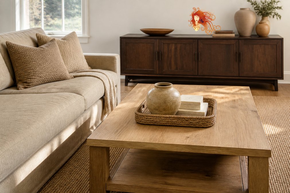
A bright, stylish living room with a light oak coffee table and a dark walnut media console, styled with a neutral linen sofa and textured throw pillows to bridge the two wood finishes.
Step 3: How to Coordinate Wood Furniture by Grain and Texture
Grain pattern is the visual fingerprint of a piece of wood, and it plays a massive role in whether two finishes feel related or mismatched. When coordinating wood furniture, you are matching more than color; you are matching the visual weight and rhythm of the grain lines themselves.
Bold, dramatic grains like oak with its prominent cathedrals or ash with its pronounced rings carry a lot of visual weight. Pairing two heavily grained pieces in different tones can feel busy, so balance a bold grain with a quieter one, such as maple or cherry, which have subtle, uniform textures. This contrast in texture is often what makes a mix feel high-end rather than haphazard, because it adds a layer of sophistication beyond simple color matching.
The finish also changes how grain reads. A matte finish absorbs light and softens the appearance of grain, making it easier to blend with other pieces, while a glossy finish reflects light and amplifies the grain pattern, making the piece stand out more. If you are struggling to coordinate a heavily grained piece, consider whether a matte or satin finish on surrounding furniture would help quiet the visual competition.
When shopping for consignment or secondhand pieces, run your hand across the surface. A piece with visible, tactile grain will feel different under your palm than a smooth veneer, and this physical check helps you predict how it will interact with your existing furniture before you commit.
Step 4: Mixing Wood Tones with White Furniture for a Fresh Look
Mixing wood tones with white furniture is one of the most forgiving strategies available, because white acts as a neutral buffer that visually separates competing wood finishes. A white sofa, white built-in shelving, or a whitewashed console gives the eye a place to rest, preventing two different woods from directly clashing.
This approach is particularly effective in smaller living rooms or spaces with limited natural light, where too much dark wood can feel heavy. The white furniture reflects light and creates breathing room, allowing you to introduce a wider range of wood tones without overwhelming the space. For example, a white slipcovered armchair positioned between a dark walnut side table and a light oak bookshelf breaks the direct visual line between the two woods, making the combination feel intentional.
White also provides a clean backdrop that highlights the natural beauty of the wood grain. If you have a statement piece with exceptional grain, such as a reclaimed wood coffee table, placing it against or near white furniture ensures it becomes the focal point rather than competing with other wood elements for attention. This technique is a favorite of designers working in transitional and coastal styles as outlined by Studio McGee, where a fresh, airy feel is the priority.
Step 5: Use Neutral Accessories and Repetition to Bridge Finishes
Neutral accessories, including area rugs, textiles, and decor in cream, gray, or tan, act as visual bridges that connect disparate wood tones and create a sense of flow. When two wood pieces feel like they are fighting each other, placing a neutral element between them, such as a jute rug or a linen throw, softens the transition and gives the eye a cohesive path to follow.
Repetition is the second half of this strategy. If you have a dark walnut coffee table, repeating that dark tone in a smaller piece across the room, such as a picture frame or a lamp base, creates a visual echo that ties the space together. This does not mean every dark piece needs a twin, but rather that your eye should be able to trace a pattern of similar tones moving through the room, which is a core principle of cohesive design.
Texture also plays a role in bridging. A chunky knit throw, a woven basket, or a leather ottoman adds tactile variety that distracts from any minor undertone mismatches. These elements introduce a layer of interior styling that makes the room feel lived-in and curated, rather than simply a collection of wood furniture. For a deeper look at how texture and layering create warmth, Apartment Therapy’s design guides offer practical visual examples of these principles in action.
Common Mistakes to Avoid When Mixing Wood Finishes
The most common mistake when mixing wood finishes is ignoring undertones entirely and matching only by color depth, which leads to clashing warm and cool pieces that feel unintentional. A second frequent error is clustering all wood furniture on one side of the room, which creates a visual imbalance and makes the mix feel lopsided rather than deliberate.
Another pitfall is over-accessorizing with wood-toned decor. If your furniture already includes three wood tones, adding wooden picture frames, wooden bowls, and wooden candle holders can push the room past the point of cohesion into chaos. Instead, use non-wood materials, such as ceramic, glass, or metal, for accessories to give the wood a chance to breathe.
Finally, do not forget the impact of lighting on wood perception. A warm-toned lamp bulb can make a cool ash finish look muddy, while a cool LED bulb can drain the warmth from a honey oak piece. Before rearranging your entire room, observe your wood tones at different times of day and under your actual lighting fixtures, since lighting guidance from the American Lighting Association emphasizes that color temperature dramatically changes how finishes appear. Swapping a bulb is often the cheapest fix for a room that feels slightly off.
Final Thoughts on Mixing Wood Tones
Mastering how to mix wood tones in a living room comes down to a simple shift in mindset: stop trying to match and start learning to coordinate. By limiting your palette to three tones, respecting undertones, balancing contrast with the 70-20-10 rule, and using white furniture and neutral accessories as bridges, you can create a space that feels layered, warm, and intentional.
The practical challenge is finding pieces that fit your specific tonal framework without blowing your budget. This is where shopping consignment excels, because the inventory is naturally varied, offering everything from light oak to dark walnut in one place, which makes it easier to see how different woods interact in person. At Le Rouge Tete, our unique “live in” store layout displays furniture in styled room settings rather than on a sales floor, so you can walk through a full living room arrangement and see exactly how a warm cherry sideboard pairs with a cool gray console before you buy. Our staff can also help you move pieces together for a better visualization, and with new items added weekly, you are likely to find the missing accent piece for your trio.
Frequently Asked Questions
Should all wood furniture in a living room match?
No. Matching every wood finish creates a flat, uninteresting space. The goal is cohesion, not uniformity. Mixing wood tones adds depth and character. To keep it intentional, stick to a dominant tone for about 60% of the room and use a secondary tone for 30%. The remaining 10% can be a contrasting accent piece. This approach gives the room a curated feel without looking chaotic.
What is the rule of three for mixing wood tones?
The rule of three is a guideline that suggests limiting a room to three distinct wood tones or finishes. Using more than three can make the space feel cluttered and disjointed. A simple way to apply this is to choose one dominant tone, like a medium oak floor, and two supporting tones, such as a dark walnut coffee table and a light maple side table. This creates visual variety while maintaining a balanced, cohesive design.
How do you balance wood tones with other colors?
Balance wood tones by using a neutral palette as your anchor. Walls, rugs, and large upholstered pieces in whites, creams, grays, or greiges create a visual rest area between different woods. This allows each finish to stand out without clashing. You can also use textiles like curtains or throw pillows to pick up the undertone of a specific wood piece, tying the whole scheme together.
How do you transition between different wood finishes?
The simplest way to transition between different wood finishes is to introduce a buffer. A large area rug that sits under furniture can visually separate a dark wood coffee table from a lighter wood floor. Similarly, placing a piece with a matte finish next to a glossy one softens the transition. Adding plants, which have their own organic texture, also helps bridge the gap between disparate tones.
Mixing wood tones is a skill that improves with practice, and the best way to build confidence is to see your options in a realistic setting. Visit Le Rouge Tete in Morehead City to explore our curated selection of pre-loved furniture, where you can inspect grain, undertones, and finishes up close and get personalized styling advice. Get started with Le Rouge Tete and find the pieces that bring your living room together.